Make a chart
c charts the rows the query and filters leave, starting from a chart chosen for the column cursor’s column. Esc returns to the table.
| Cursor column | Chart c opens |
|---|---|
| A number | Its histogram |
| Text, categorical or boolean | A bar of its counts per value |
| A date or a time | A line over it, of the first numeric column (Y is left to pick when there is none) |
The panel says suggested for f64 under Type until the type is changed.
c again from the same column on the same dataset brings back the
chart as it was left; from another column it suggests again.
The panel
The panel on the left holds four shelves, the same four for every type, then
the options. A shelf the type does not use stays in place, dimmed, with why
(density, same as X); focus passes over it.
| Shelf | Holds | Under it |
|---|---|---|
| Type | Line, Scatter, Bar, Histogram, Box, KDE, Heatmap | suggested for <type> |
| X | A column: what the type takes on X | The time bucket of a date X on a line or scatter; the bar order; the histogram’s bins |
| Y | A column, several on a line or scatter (one series each); on a histogram, count or share | On a line, scatter or bar, the Aggregate row, and cumulative when it is on |
| Color | A category column: one series per value | Which values: top 10 of 16 by rows, all 3, 3 picked of 4,812 |
The plot’s title row says how the chart is made of the rows: mean by month, running sum, colored by carrier, count per bin, one box per carrier. The
columns are named at their axes, the Y column over the y axis and X under the
x axis at the right, so the title row is blank for a plain line or scatter. At
its right end, dimmed, the chart says what it read: sample of 10,000 of 337k rows · seed 42891, 1,207 values outside p1-p99. The seed draws the same
sample again; a chart of every row names none. When the row is too narrow for both, the
notes are cut with …, or left out.
Plot two columns
Open Palmer penguins from Example datasets, as in the quick start, then:
- Press c, then 2 for Scatter.
- Choose
flipper_length_mmfor X andbody_mass_gfor Y.
Use ↓ to move through the rows and Space to open a shelf’s picker. Type part of a name to narrow it; on Y, Space toggles a column and Enter closes the picker. The picker leaves out the X column. The two penguins with no measurements are left out.
Points are drawn in X order, so a line runs left to right whatever order the table is in. Nulls are dropped per series: a row with no X is left out, and a missing Y drops that series’ point and breaks its line. Other series keep their points.
Esc keeps the chart as you left it: sort or filter the table, press c on the same column, and the same shelves chart the new view. A column the view no longer has is dropped from the chart. Opening another dataset starts over.
Aggregate
The Aggregate row under Y, on a line, scatter or bar: ←
→ step through none, count, distinct, sum, mean, median, stdev, quantile,
min, max, first and last. With
one, the rows that share an X (and a color) are made one point, or one bar, over every row of the view, in one
group-by in the background; the chart says how many rows in its title row (all 336,776 rows, or rows in the groups shown when a color leaves values out without Other),
and the footer Grouping 337k rows... while it runs. Without one, a
chart samples, and says so.
| Aggregate | Each point or bar | Y |
|---|---|---|
| count | The rows | None needed |
| distinct | The different values, nulls left out (nunique in a query counts a null as one) | Any column, text too; another aggregate lets a text Y go |
| sum, mean, median, min, max | As named | A number |
| stdev | The sample standard deviation (n − 1). A group of one row has none and draws no point | A number |
| quantile | The percentile on the line under Aggregate, p90 to start; ← → there step 1, 5, 10, 25, 75, 90, 95 and 99. Linear interpolation between the two nearest values | A number |
| first, last | The first or last value in the view’s order, nulls passed over: its sort, which Aggregate names (last · by time_hour ▲), or else the order the rows were read in (last · by row order) | A number |
| Option | What it does |
|---|---|
| Time bucket | Line and Scatter, under a date or datetime X: none, day, week (from Monday), month, quarter, year. A bucket with no aggregate takes mean; an aggregate on a date X with no bucket starts by the day |
| Cumulative | Line and Scatter, with count, sum, mean, median, min or max; the others take none, since a running sum of distinct counts, deviations, percentiles or first values is none of those so far: off, running sum, or compound. The rows run as a total in X order, per series, and each point is the total at the end of its X or bucket: a running sum of Y, or Y’s rates compounded over every row, (1 + y1)(1 + y2)… − 1. The aggregate is set aside meanwhile (a count runs as a count of rows); Aggregate says mean · compound of rows |
An X of more than about 200,000 values is refused before any row is grouped, judged from a sample of X, with the advice to bucket it.
On NYC flights (2013), with no query: press c on carrier, pick
arr_delay for Y and step the aggregate to mean. Sixteen bars, F9
longest at 21.92 minutes; HA and AS arrive early on average, so their bars
grow left of zero.
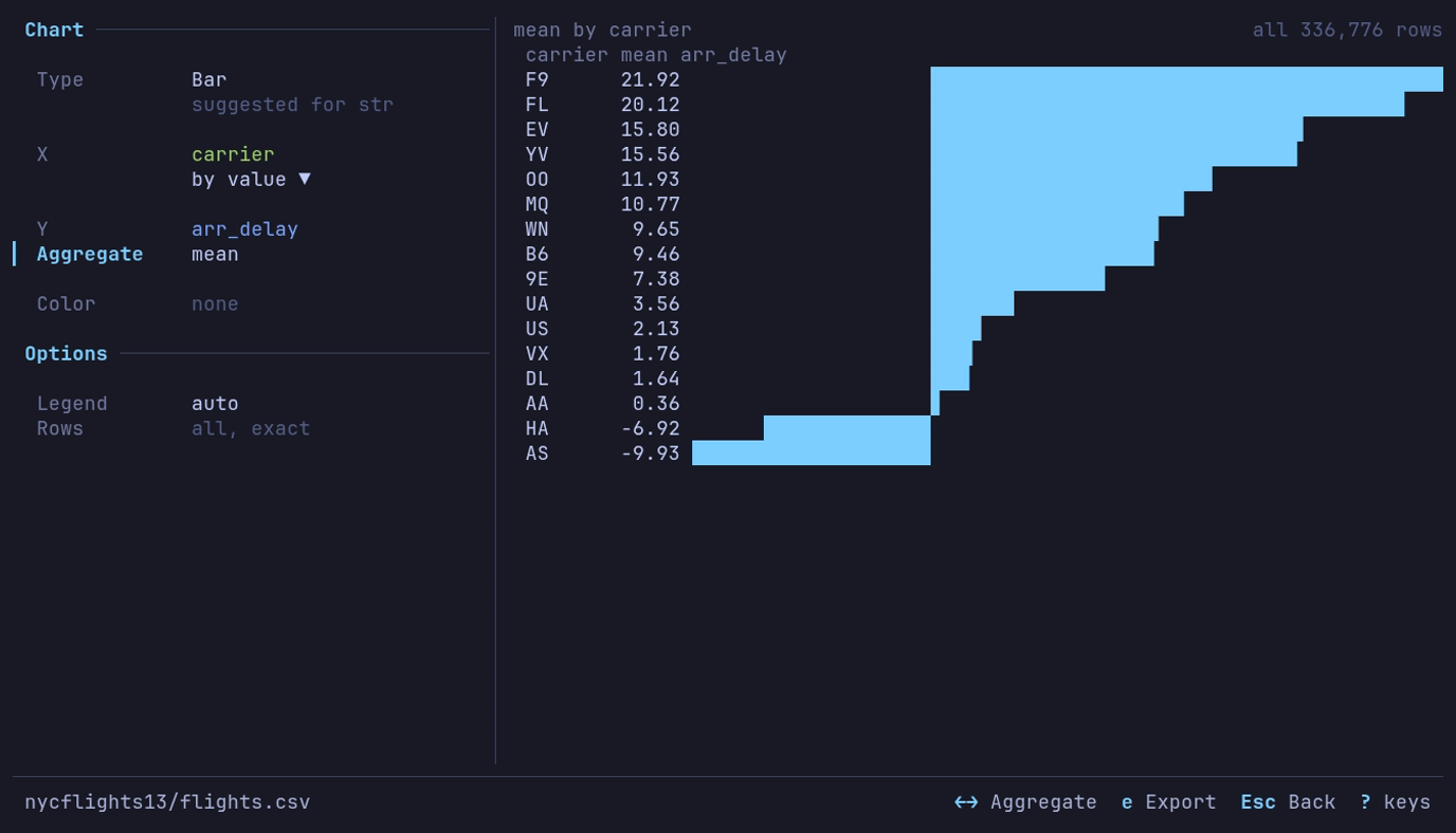
Which airlines arrive late? F9, by 21.92 minutes on average. c on
carrier, Y arr_delay, → on Aggregate to mean.
Color
Color splits a chart into one series per value of a category column, each in its own palette color. Without a pick, the ten values with the most rows are drawn (all of them, when the view is filtered to fewer); the line under Color says which. Space on that line lists every value with its rows, most first: type to narrow, Space toggles a value (up to ten), Enter charts the ones picked. The values are counted over the whole view.
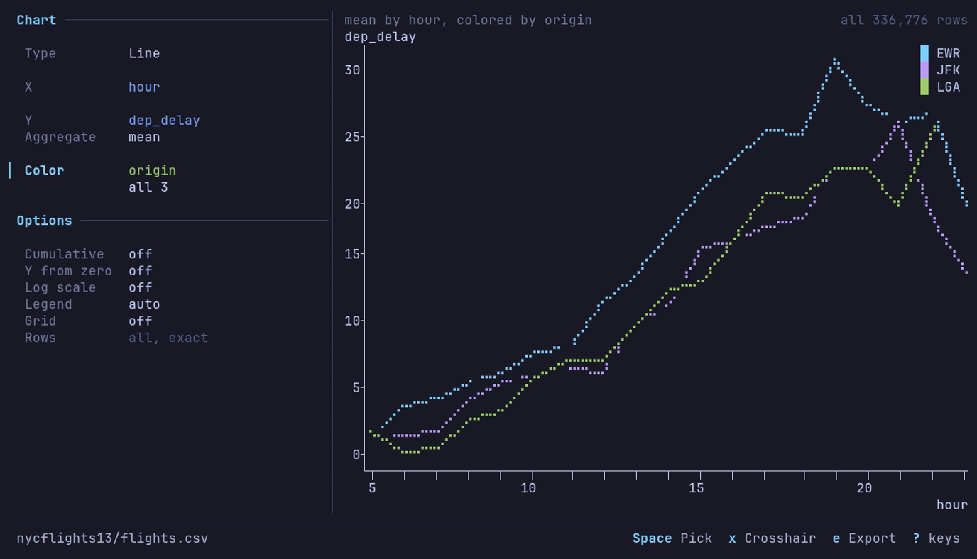
Which New York airport leaves latest, and when? Newark in the evening,
31.1 minutes on average at 19:00. A line of dep_delay by hour,
Aggregate mean, Color origin.
Other gathers every value without a series of its own into one more
series, the legend’s last entry, in dimmed. ← → on the
line under Color turn it on or off; the line then reads top 10 + 6 other
or 3 picked + 4,809 other. It starts on for a scatter and off for the other
types. When every value has a series there is no Other.
| Type | With Color |
|---|---|
| Line, Scatter | A line or set of points per value. Other is one more line, aggregated over the rest as the others are; on a scatter its points are drawn under the colored ones, so the cloud keeps its shape. Several Y columns are already one series each, so Color is dimmed |
| Bar | A bar per value in each category’s row, under a legend of the values; Other is one more bar per category. Needs an aggregate |
| Histogram | Each value’s bins as an outline over the others, which filled bars would hide. Y can be share of group: each bin’s share of its group’s rows inside the range, so groups of different sizes compare. Other is one more outline. The range (p1-p99) is the whole column’s |
| KDE | A curve per value; Other is one more |
| Box | Dimmed: a category on X already makes a box per value, ten by rows |
| Heatmap | Dimmed |
A null value is a series of its own, named null.
Chart types
| Type | Plots | X | Y |
|---|---|---|---|
| Line | Lines in X order | A number, date or time | Up to ten numeric columns, or a count |
| Scatter | Points | A number, date or time | Up to ten numeric columns, or a count |
| Bar | One horizontal bar per category | A text, categorical, boolean or integer column | A numeric column with an aggregate, a count, or a column already one row per category |
| Histogram | Rows per bin | A number | Count or share |
| Box | Quartiles and whiskers | A category, one box per value, or none | A number |
| KDE | A smoothed density curve | A number | Density |
| Heatmap | Density of two variables | A number | A number |
| Option | Types | What it does |
|---|---|---|
| Bins | Histogram (under X), Heatmap | 5 to 100 bins for a histogram, 5 to 60 a side for a heatmap |
| Bandwidth | KDE | A multiple of the usual bandwidth, 0.2x to 5.0x |
| Range | Histogram, Box, KDE | All values, or p1-p99 (the 1st to 99th percentile) to leave out outliers that squash the rest; the chart counts what it left out |
| Order | Bar (under X) | By value, largest first, or by label: text A to Z, numbers ascending |
| Y from zero, Log scale | Line, Scatter | The Y axis from zero; ln(1 + y), its ticks naming y |
| Legend | Line, Scatter, Bar, Histogram, KDE | auto or off |
| Grid | Line, Scatter, Histogram, Box, KDE | Lines at the labeled ticks |
| Rows | Charts that sample | Sample of a size, or Every row; an aggregate reads every row and says all, exact. See Large tables |
Axes, grid and legend
Ticks fall on round values, steps of 1, 2 or 5 times a power of ten (or 25, 250 and so on), as many as the plot has room for: about one label per 15 columns and one per 4 rows. The y axis runs from the round value below the data to the one above it. Smaller unlabeled ticks mark the steps between labels where there is room.
| Axis | Ticks and labels |
|---|---|
| Numbers | One notation and precision per axis, in the table’s digit grouping and decimal separator (number format). Counts and integer columns tick in whole numbers |
| Dates and times | Calendar boundaries: years, months, days, hours, minutes. A label names the unit that turns there: 2026 at a new year, Apr at a new month, Mar 5 at a new day among hours, otherwise 12 or 06:00. The first label also names the year |
| Log scale | 1, 10, 100 and on, with 2 and 5 between when there is room, and 0 where the data starts there; one format, shortened to 1k, 10k, 1M when narrow |
| Too narrow | Fewer ticks, then shorter labels (12.3k, 12,3k); a time axis falls back to its ends. When two labels are nearest the spacing and more fit, more: 0 2 4 6, not 0 5 |
| Feature | What it does |
|---|---|
| Grid | Dotted lines at the labeled ticks, under the series, in chart_grid. g or the Grid row toggles it; chart_grid in the [analysis] section sets where a new chart starts (off) |
| Legend | Names the series when there are two or more: a swatch and a name per series, with no frame, cleared from the plot where it covers the fewest points (a corner, or the middle of an edge). The Legend row hides it |
| Crosshair | Line and Scatter: x gives the plot the keys. ← → step a line down the plot from point to point (a column at a time where they crowd), Home End go to the ends, and under the plot a readout gives x and each series’ value there: date: 2020-04-30 high_temp: 67.2. A series with no value there reads ∅. x, Tab or Esc hand the keys back to the panel. A click on the plot puts the crosshair there |
| Marks | Lines in braille. A scatter marks each point with a dot, or in braille past one point per four cells. Histogram bars fill their bins |
Without UTF-8 the grid is . and : and the tick marks +. Exports and the
Distribution plots write their numbers the same way.
Count rows per category
With Palmer penguins open, press c on species: a bar of its
counts. The bars read Adelie 152, Gentoo 124, Chinstrap 68: no query needed.
Counts are exact. The whole view is counted in one pass that keeps a count per
category and no rows, whatever the sample size, and the chart says so under the
plot: all 344 rows.
| Case | What happens |
|---|---|
| More than 100,000 categories | The count stops and the chart says so. Count by a column with fewer values |
| A null category | Its own bar, labeled ∅ |
| Equal counts | A to Z |
| Another category, or leaving the chart, while it counts | The count stops; nothing partial is kept |
Chart one value per category
With the aggregate none, a bar chart takes a result that is already one row per category: the bar is the row’s value. Group first with a query, then chart it. On NYC flights (2013):
- Press : and run
SELECT carrier, AVG(arr_delay) AS delay, COUNT(*) AS flights FROM df GROUP BY carrier ORDER BY delay DESC. - Press c on
carrier, pickdelayfor Y, and step the aggregate to none.
The same sixteen bars as the mean above, F9 longest at 21.92 minutes.
| Case | What happens |
|---|---|
| A category repeats | Refused: the chart says how many rows and categories it found and suggests the query that groups them, or an aggregate. Bars are not summed or averaged for you |
| More bars than rows | The bars that fit, then + 212 more counting the rest |
| Negative values | Bars grow left of zero |
| A null category | Its own bar, labeled ∅ |
| A null value | That category is left out and counted in the title row |
A chart with no aggregate reads at most Rows rows, so a grouped result with more categories than that is sampled, and says so.
Examples on the built-in datasets
Each starts from the dataset of that name under Example datasets.
| Chart | Data and query | Settings | What you see |
|---|---|---|---|
| JFK delay by hour | NYC flights, the JFK query | Line; X hour, Y mean_delay | A climb from 0.5 minutes at 5:00 to 26.1 at 21:00 |
| A year of delays | NYC flights, the daily query | Line; X flight_date, Y delay | 2013 on a date axis; the peak is 83.54 on 2013-03-08 |
| Delay by carrier | NYC flights, no query | Bar; X carrier, Y arr_delay, mean | F9 longest at 21.92 minutes |
| Names per year | US baby names, no query | Line; X year, Y name, distinct | 1,889 different names in 1880, a peak of 32,510 in 2008 |
| Delay spread by month | NYC flights, no query | Line; X month, Y dep_delay, stdev | Widest in July at 51.6 minutes, narrowest in November at 27.6 |
| Late departures by month | NYC flights, no query | Line; X month, Y dep_delay, quantile p90 | One flight in ten leaves 79 or more minutes late in July, 26 in September and November |
| Last flights of 2013 | NYC flights, sorted by time_hour | Bar; X carrier, Y dep_delay, last | WN’s last departure of the year 48 minutes late, FL’s 14 minutes early |
| Three names | US baby names, the pivot of Emma, Jennifer and Olivia | Line; X year, Y Emma, Jennifer, Olivia | Jennifer’s peak of 63,604 in 1972; Emma and Olivia rising after 2000. Emma and Olivia start in 1880; Jennifer, with no published counts before 1916, starts there |
| Launches per year | Space launches, the count pivot | Line; X launch_year, Y F, O | O, launches that reached orbit, near 130 a year from the late 1960s to the mid-1980s, then a slump in the 1990s; F, failures, along the bottom |
| Central Park highs | NOAA daily weather, by_year/YEAR=2024/ELEMENT=TMAX, the station query | Line; X day, Y high_c | 366 daily highs from −6.0 to 35.0 °C |
| Earthquakes on a map | Earthquakes (past month), no query | Scatter; X longitude, Y latitude | The Pacific Ring of Fire. A sample of 10,000; set Rows to Every row for all of them |
| Calories by chain | Food nutrition, the restaurant summary | Bar; X restaurant, Y avg_calories, none | Mcdonalds first at 640, Chick Fil-A last at 384 |
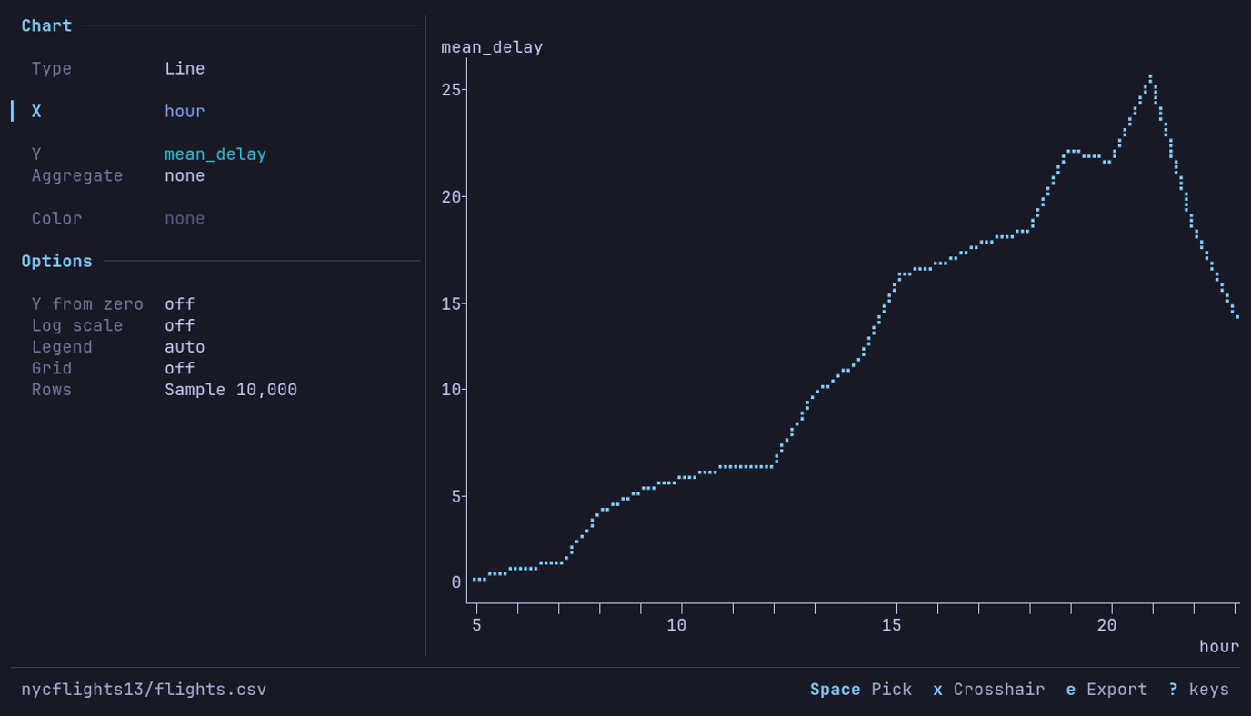
When does a JFK departure leave late? In the evening, 26.1 minutes on average
at 21:00. The JFK query, then c
1 on mean_delay, X hour.
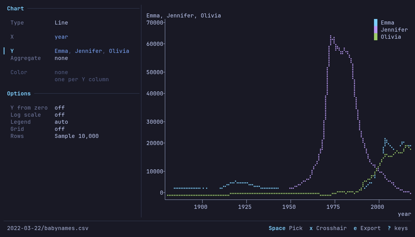
How did three names rise and fall? Jennifer peaks at 63,604 in 1972; Emma and
Olivia rise after 2000. The pivot, then c
1, X year, Y all three.
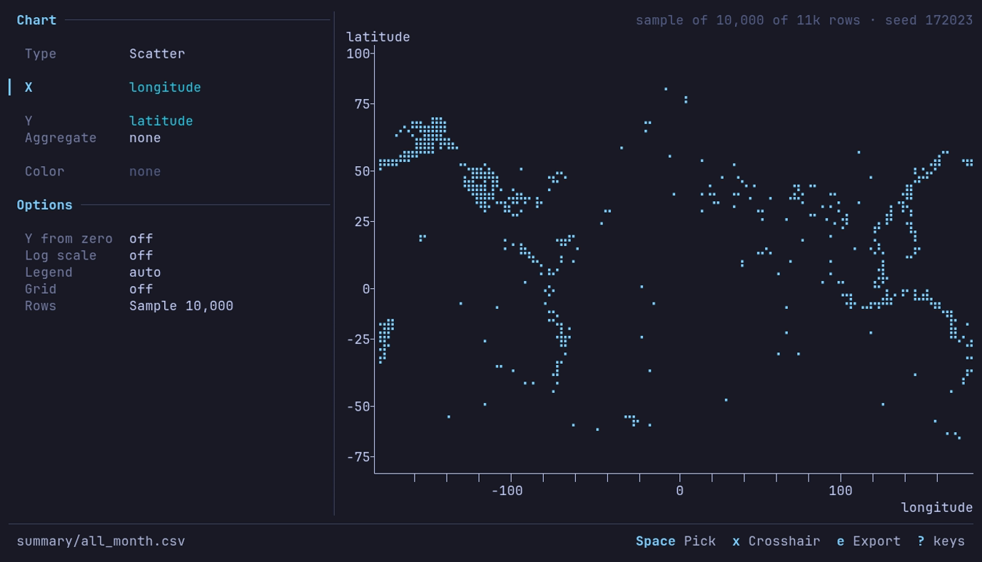
Where does the earth shake? Around the Pacific. c 2 on
latitude, X longitude. A rolling feed: your month draws its own points.
Large tables
| Option | What it does |
|---|---|
| Rows | Rows a chart without an aggregate reads. A larger table is sampled across all of it, and the chart says so at the right of the title row, with the sample’s seed: sample of 10,000 of 3.5M rows · seed 42891. Every row reads the whole view. A Line over a larger table is not sampled: see below |
| Aggregate | Reads every row, whatever the sample size |
| The view’s sample | Read whole: the Rows row goes, and the title row names the sample and its seed: sample 100,000 of 3.48M · seed 42891 |
On Rows:
| Key | Does |
|---|---|
| ← → or Space | Switch between Sample 10,000 and Every row (36.8M), which names the view’s rows once the table has counted them |
| Digits | Type a sample size in place: 50000, 50,000, 50k, 250k, 2m. A size of at least the view’s rows is Every row |
| Backspace | Edit the size being typed |
| Enter | Read what the row says. Leaving the row reads it too |
| Esc | Put the row back as it was, without reading |
Nothing is read while the row is being changed: the chart stays as drawn, and
the line under the row says Enter to read. A size that is not one (12x, 0)
says why there and is not read. Sample keeps its size while Every row is
chosen.
The sample is drawn as the analysis tools
draw theirs, with the same seed: 50 runs of one Parquet or IPC file, or one
streamed pass over anything else. Another option, or another chart of columns
already read, draws from the same rows without reading the table again. An
exported chart carries the same notes under the plot. The default size comes
from chart_rows in the
[analysis] config section and is 10,000.
A Line chart with no aggregate and no color, over more rows than the sample
size, draws an envelope instead: X is cut into half as many steps as the sample
size, and each step draws its lowest and highest value, so every peak of a
waveform or a long time series stays on the plot where a sample would miss it.
Two streamed passes read the view: the rows and X’s range, then each step. The
chart says so in its title row: min and max of 192M rows in 5,000 steps.
Scatter keeps the sample, and so does a Line over Parquet read in place from
S3, GCS or Azure, which the envelope would download whole twice.
Keys
| Key | Action |
|---|---|
| 1–7 | Switch the type directly, from anywhere: Line, Scatter, Bar, Histogram, Box, KDE, Heatmap ([ ] step) |
| ↓ ↑ or Tab Shift+Tab | Move between the panel’s rows |
| Space Enter | Open a shelf’s picker, or the Color values; toggle an option, or take its next value. The panel applies as it changes, so Enter acts as Space does |
| ← → | Step the type, the time bucket, the aggregate, cumulative, bins, range, order or sample size (+ - too, PgUp PgDn for bigger steps on the sample size); on a shelf of one column, the previous or next column; flip a toggle |
| g | Grid on or off |
| x | The crosshair, on a line or scatter chart |
| e | Export the chart |
| ? | Help |
| Esc | Back to the table |
In a picker: type part of a name to narrow, ↑ ↓ move, Enter or Space chooses (on a line or scatter chart’s Y and on the Color values Space toggles one in or out), Tab or Shift+Tab chooses and moves to the next or previous row, and Esc backs out of the picker alone.
Export
e in the chart view opens the export dialog, on its path. Type a
path and press Enter; the keys are those of every
dialog, and Ctrl+P recalls a
path exported to before. A path ending .png, .svg or .pdf takes that
format; any other path gets Format’s extension after it (chart.v2 writes
chart.v2.png). You are asked before an
existing file is overwritten, and a failed export leaves it as it was
(Overwriting). A blank path, or a failed
write, keeps the dialog open with the reason under the fields.
| Field | What it sets |
|---|---|
| Format | PNG, SVG or PDF; SVG and PDF are vector, their text set as outlines |
| Style | Light: white, with colors that stay apart for color-blind readers and in print. Dark: the terminal theme’s colors. Transparent: Light with no background |
| Size | A preset, below; typing Width or Height makes it Custom |
| Legend | Line ends: each line named at its right end, the default for line and KDE charts (other charts take a legend at the top right). A corner, or Off. A chart whose legend is off exports with it off |
| Opacity | Scatter: Auto (the default) draws points opaque up to 1,000 and fainter as there are more, down to 15% from 100,000, so a dense cloud shows where it is densest; or 100%, 50%, 20% |
| Point size | Scatter: Small, Medium (the default) or Large, 1.6, 2.4 or 3.6 pt |
| Line width | Line, colored or not: Thin, Normal (the default) or Bold, 1, 1.5 or 2.5 pt; the legend’s swatches follow |
| Y from zero | Line: On takes zero into the Y axis. It starts as the chart’s Y from zero option. Bars always start at zero |
| Title, Description | Over the chart. The description starts as the title row’s words, how the chart is made: Mean by month, colored by carrier; empty when it has none. The Y column is named over the plot’s left edge, as on screen |
| Notes | Under the chart, after what the chart says about its rows (a sample, values a range left out) |
| Source, Byline | The last line: Source: … and the byline. Source starts from the catalog entry when the dataset came from one: its name, publisher and license |
| Recipe | Include (the default, from chart.export_recipe) writes how the chart was made into the file; Omit writes no datui metadata at all |
| Size | Pixels | Prints at |
|---|---|---|
| Slide 16:9 | 1920 × 1080 | 10 × 5.6 in |
| Document | 1600 × 1000 | 10 × 6.25 in |
| Square | 1200 × 1200 | 8 × 8 in |
| Single column | 1050 × 788 | 3.5 × 2.6 in, 300 dpi |
| Double column | 2100 × 1300 | 7 × 4.3 in, 300 dpi |
| Custom | 16 to 8,192 a side | the last preset’s resolution |
The recipe is a JSON document that reads back as a view:
| Key | Holds |
|---|---|
datui | The version that wrote it |
source | The path, or the URL without its user, password, query string or fragment |
table | The table of a file of tables, when it is one |
rows | What the chart read: the sample with its seed, or every row |
settings | The view’s: the sample’s scope, method, size, seed and how it was drawn, with the view it was drawn through; the query, filters, sort, column layout and types, reshape; the chart, its options and its export settings, the dialog’s words included |
| The image is the same either way; the recipe can carry paths, | |
| bucket names and query values, so Omit before sharing a file that should not. |
| Format | Recipe in |
|---|---|
| PNG | An iTXt chunk, keyword datui-recipe |
| SVG | A <metadata> element, the root’s first child |
The document info, /DatuiRecipe |
datui -c chart.export_recipe=false
Text is set in IBM Plex Sans, bundled with datui, so a chart comes out the same on every machine; a character it lacks falls back to a system font. Its size follows the page: smaller on a journal column, larger on a slide. A bar chart exports up to its first 100 bars and counts the rest.
Colors
Series take chart_1 through chart_10 from the
theme, in order; bars and histograms take
chart_1, Other dimmed, and the grid chart_grid. The Dark export takes
the same slots, its background background, and its text text_primary and
text_secondary.
Two series never share a color. A slot the theme gives the same color as an
earlier one is skipped, and on a 256- or 16-color terminal, or under
NO_COLOR, the slots are counted as the terminal shows them: a chart draws one
series per distinct color, so a 16-color terminal draws fewer (top 4 of 16 by rows), with Other for the rest when it is on. A Dark export skips a
repeated slot too, and otherwise always has all ten.